The Login Page Settings go hand-in-hand with the Portal Settings, but if you don't distribute your content through the Vitrium portal and still require users to log into your content directly, you can just refer to the Login Page Settings here.
Login Page Settings
Vitrium’s web viewer login page can be customized to match your company’s brand. Add more impact by using a background image and complementary colors. To access the Login Page Settings:
- In your Vitrium account, go to SETTINGS
- Click Login Page Settings
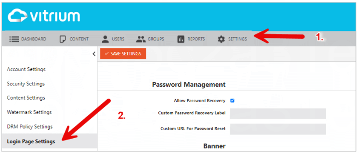
- Enter the following information, then click SAVE SETTINGS
Password Management
- Allow Password Recovery: Check this option if you want users to have the “Forgot password” link shown on your login page.
- Custom Password Recovery Label: Enter custom text to display for the “Forgot Password” hyperlink.
- Custom URL for Password Reset: Enter your own URL here if you want to direct users to your system for password resets. Applicable to Enterprise customers only that use an External Service.
Banner & Button Color
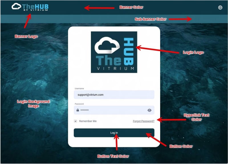
- Banner Logo: This is the logo that appears at the top left of the login page and portal page. It is best to use a transparent image if your banner is a dark color.
- Banner & Button Primary Color: This is the color of the banner and login button.
- Banner & Button Secondary Color: This sets the text color for the login button, account icon, and search bar in the banner.
Sub-Banner
- Add Sub-Banner: Check this field if you want to add a sub-banner.
- Sub-Banner Color: Choose a color from the color selector or enter a hex code to use for your sub-banner.
- Sub-Banner Content Type: Choose whether you want your sub-banner to include text or logos in it.
If you choose Text, you will then see.- Sub-Banner Description:
This sets the format and text description for the sub-banner. Can be edited with HTML.
- Sub-Banner Alignment: choose how you want your logos to appear in the sub-banner - aligned center, left or right
- Sub-Banner Logo 1: click browse to select and upload your logo image
- Add Another Logo: click here if you want to add more logos in your sub-banner.
- Sub-Banner Description:
Other Configurations
- Login Background Image: Upload a high resolution image to show as the background image on your login page, which can make your login page stand out.
- Login Logo: Upload a logo to be displayed on the login page.
- Login Text: Add any optional text here that you want. These could be instructions to help users login or provide additional information about your portal or content. Use the HTML editor to change the font size, type or add hyperlinks.
Example of a Customized Login Page
Portal Settings
Vitrium’s User Portal allows you to distribute your protected content to end users via a secure web portal, which can be customized with your company logo, branding, and other details. The Vitrium team can assist you to set up and customize your, but here are the instructions to do this yourself:
- In Vitrium, go to SETTINGS
- Click Portal Settings
- Click the ‘Enable Portal’ checkbox
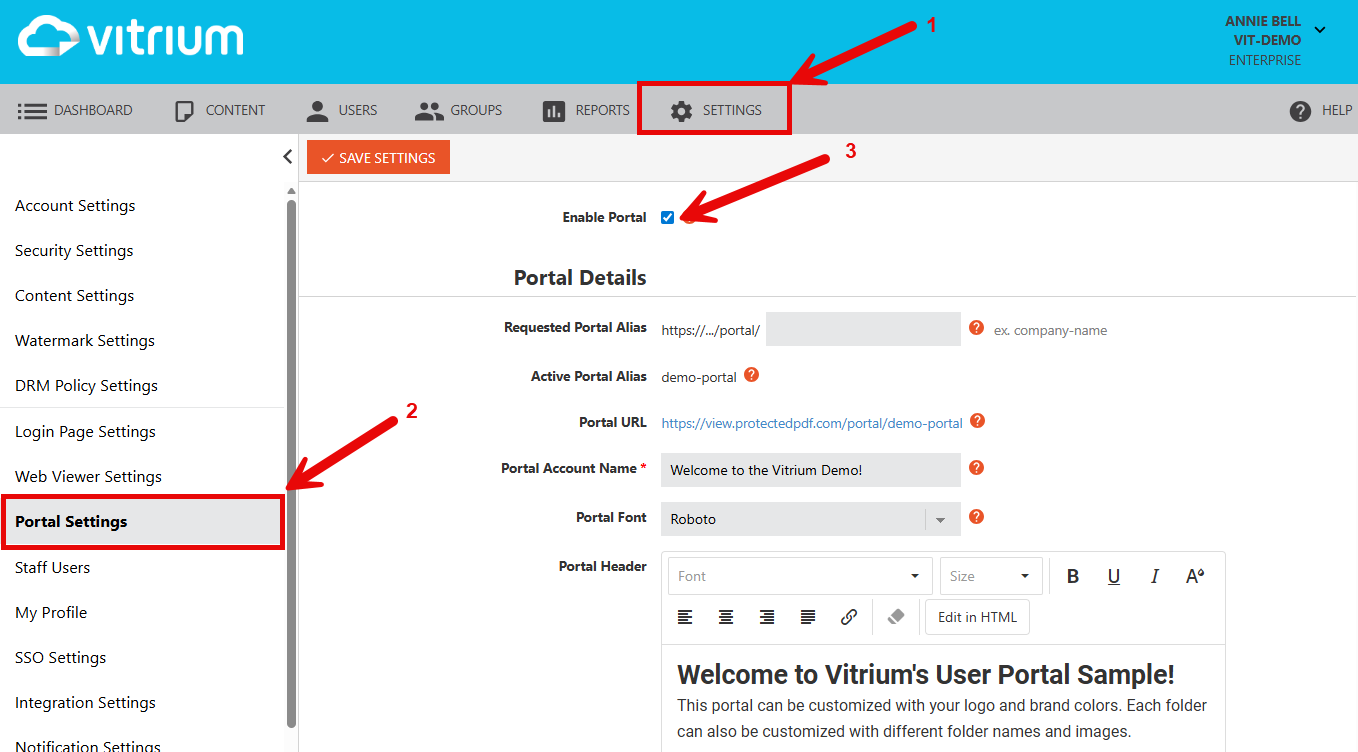
- Enter the following information, then click SAVE SETTINGS
Portal Details
- Requested Portal Alias: Enter a lower-case alias here which will appear like this in the full portal URL: https://view.protectedpdf.com/portal/your-alias. If you are planning to use a custom domain, then consider a more generic alias such as mycontent or training.
- Custom Domain
You can request to use your own company domain to replace view.protectedpdf.com. There is a small charge for this as Vitrium will host your SSL certificate on our servers.
If you only use 1 portal with Vitrium, you can then send only the short URL link: https://view.abccompany.com instead of https://view.abccompany.com/portal/mycontent
- Custom Domain
- Active Portal Alias: Your portal alias will appear here.
- Portal URL: This is the URL that you can share with your users to log in to your portal.
- Portal Account Name: This is the name of your portal.
- Portal Font: This is the font type you can choose for your portal. The default is Roboto.
- Portal Header: This is the header text that will appear on the home page of your portal. You can use the HTML editor tool to change the font type (add a bigger heading for example), to bold or underline any words, or add hyperlinks.
- Show Portal Header: You can choose to show the portal header on the home page only or on every page.
- Open Web Viewer Content: You can choose whether you want the web viewer content to open in a separate browser tab (default) or within the same tab.
User Registration
- Allow User Registration: Select this option if you want people to self-register as a “User” in Vitrium.
note
It is strongly recommended to assign permissions to “All active users” at the folder level so self-registered users get immediate access to your content. Otherwise, they will see a blank portal when they log in and you would need to manually assign them permissions. - Custom URL for User Registration: If you allow user registration, you can alternatively direct them to your own website to have them register there.
- Change ‘Register Here’ To: You can change the 'Register Here' link to any other word or phrase you prefer.
- Allow Generic Username (No Email): Select this option if you want to allow users to register with a non-email-based username. They will still need to enter an email address to receive the verification email.
- Allow User to Change Password: Select this option if you want to allow users to reset or change their password.
Folders
- Show Folders in Portal: Select this option if you want to show your folders in the user portal. The folder names and order of folders will appear the same as they are in the content tab.
NOTE: You can edit the folder appearance by choosing a default color and text in the options below, or you can customize each folder even further. Learn more in Customizing Folders - Default Folder Color: Choose a folder color that will apply to ALL the folders.
- Default Folder Text Color: Choose a folder text color that will apply to ALL the folders.
Example of Different Folder Customizations
|
Default Folder With No Changes Made |
Customized Folder Using Default Settings |
Customized Folder Using Custom Folder Settings |
.png?width=145&height=148&name=P%20128%20(1).png) |
.png?width=145&height=141&name=P%20128%20(2).png) |
.png?width=148&height=144&name=P%20128%20(3).png) |
Tile View Settings
- Secondary Information Display: Choose 1 additional piece of information that you want to appear in your tile view. This information will appear below your content title and thumbnail image.
List View Settings
- Show List View: You can choose to include a list view of your content.
- Columns to Display: You can choose to display all or only some of the additional information that is listed here.
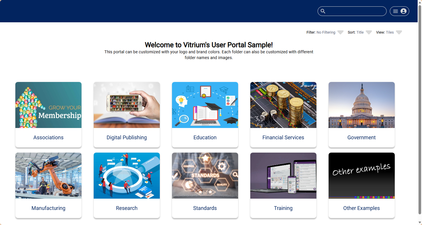
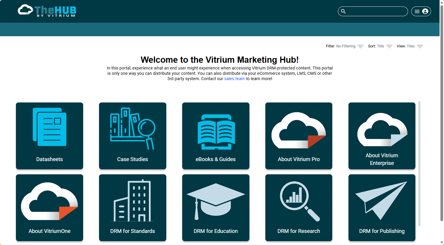
Sample Customized Portals
Here are a few different examples of custom portals that the Vitrium team created:
Web Viewer Settings
The Web Viewer Settings page is where you can configure features for the Secure Web Viewer, which is what your End Users will use to access content via web browser.
Protected PDF
- Protected PDF Downloads: Allows you to choose if you would like to offer Protected PDF downloads to your end users via the Web Viewer and the User Portal (if enabled), alongside the authentication method for downloaded files.
- Do Not Allow: This option prevents any end user from downloading a Protected PDF from the Web Viewer or User Portal.
- Allow With Automatic SSO (Recommended if downloads are enabled): This allows a user to unlock a downloaded Protected PDF automatically on their laptop or desktop device without needing to re-enter their credentials.
- Do Not Allow: This option prevents any end user from downloading a Protected PDF from the Web Viewer or User Portal.
-
- Allow With Manual Login: This option means that end users will need to re-enter their credentials when opening the downloaded Protected PDF.
- Allow With Manual Login: This option means that end users will need to re-enter their credentials when opening the downloaded Protected PDF.
- What to Include: This allows you to define what options your end users will have regarding annotations (including form fills) when downloading a Protected PDF, if enabled.
- Always Include Annotations: This will automatically include any user annotations on the downloaded Protected PDF. Comments and notes will appear on the last page.
- Never Include Annotations: User annotations and form fill data will not be included in the downloaded Protected PDF.
- Allow User the Choice to Include Annotations: This will present the end user with an option to choose if they would like to include annotations and form fill data or not in the downloaded protected PDF.
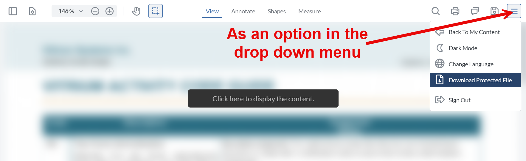
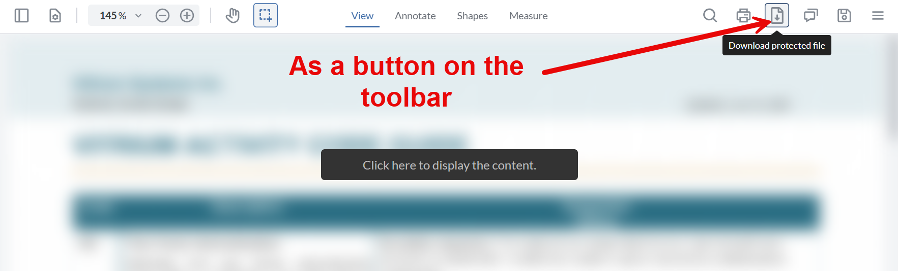
- Show in Web Viewer: This allows you to determine if you would like the download feature to appear as a button in the toolbar across the top of the Web Viewer, or be included in the hamburger menu instead.
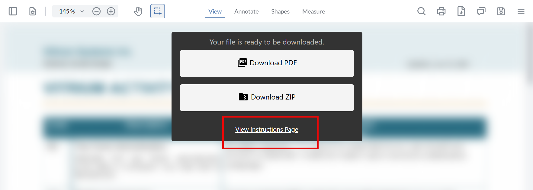
- Link to Instructions Page: If you have a web page that includes instructions or other relevant info for your end users, you can enter it here. When this field is filled out, users will see a link at the bottom of their download selection pop up. If they click on View Instructions Page they will be taken to the URL entered here. This URL must include http:// or https://
Languages
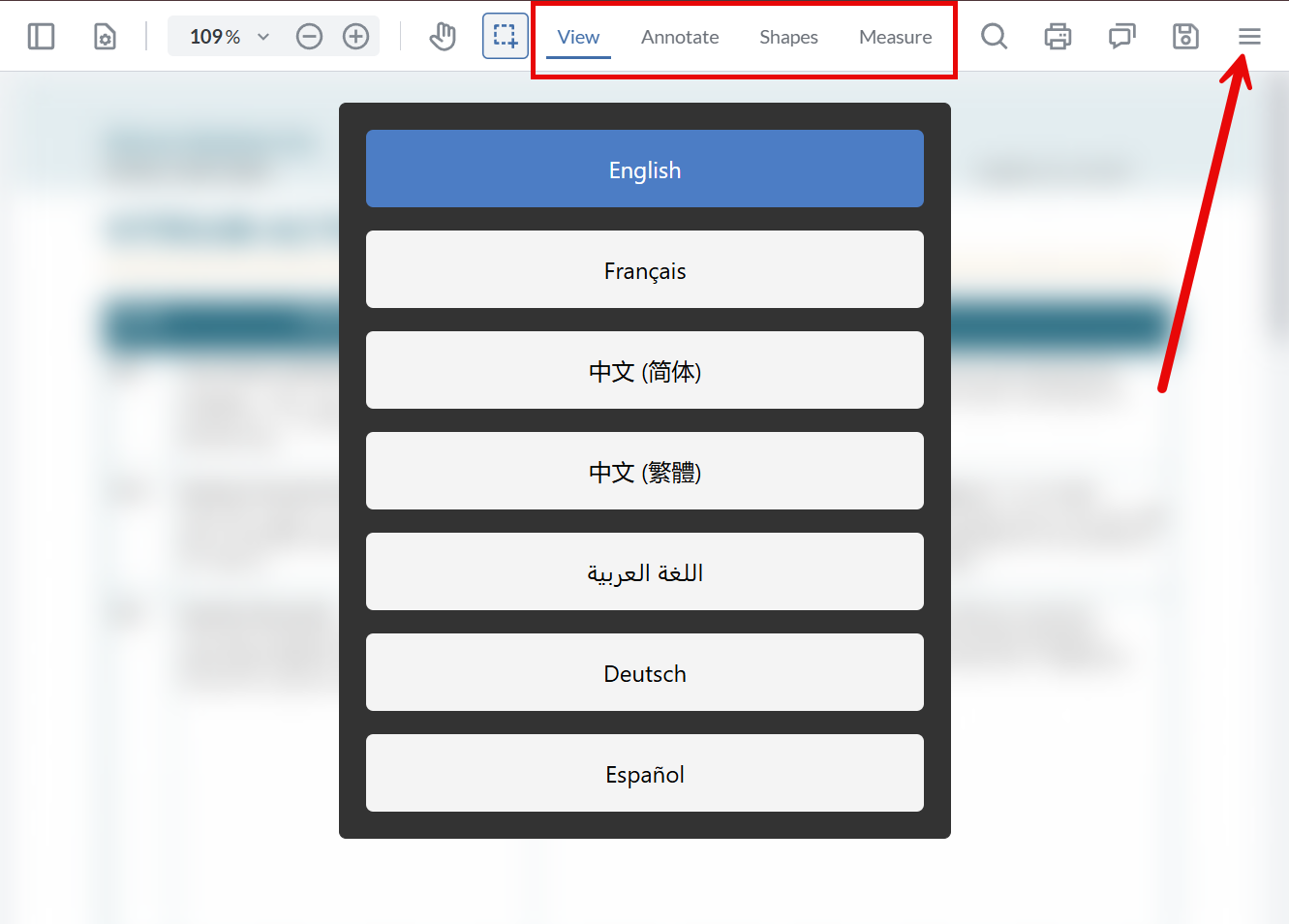
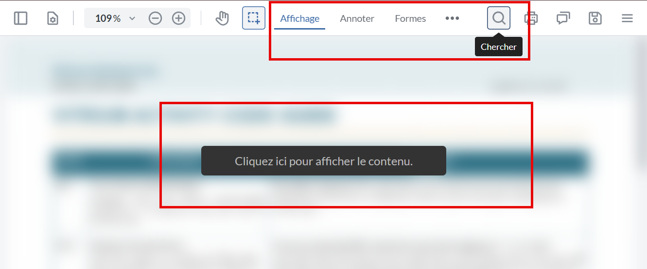
- Default Language: This feature will define a default language that Web Viewer menus, buttons, and functions display in. If your account has additional languages available and your user(s) selected a different one, the default language will display again if they clear their cookies. When multiple languages are available, users can change it at any time the Web Viewer is open.
Important Note: This does NOT change the language of or translate the content displayed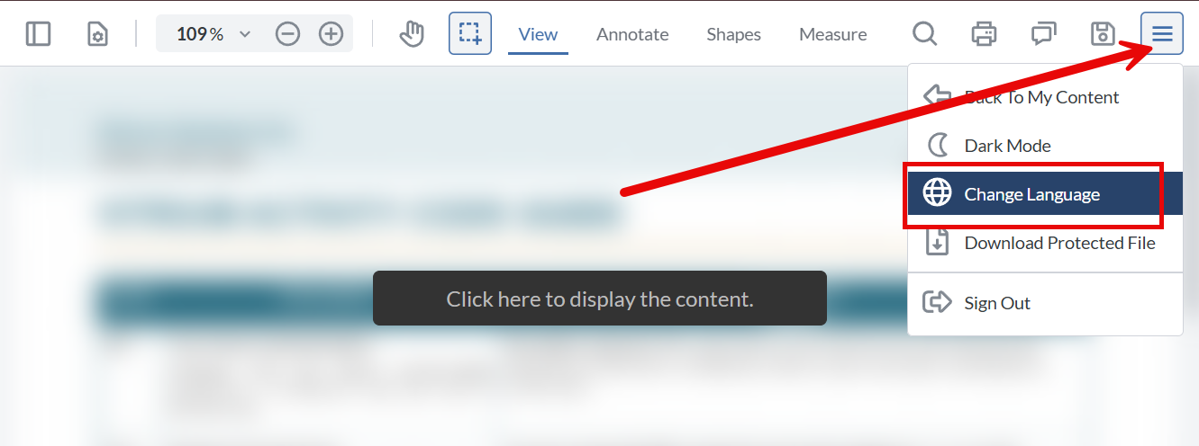
- Language 2, 3, 4, 5, 6, 7: These fields allow you to define which other languages you would like users to have access to for navigating the Web Viewer. You can choose up to 6 additional languages that are supported, including English, French, Spanish, German, Arabic, Chinese (Simple), and Chinese (Traditional). If enabled, these options will be shown in the language selection feature of the Web Viewer.
Others
-
Favicon: This is the small icon that appears next a web page's title in a browser tab. It is recommended to upload your logo here to make it easy for your end users to identify the tab as relating to your content. The image file selected needs to be 16x16 pixels, using 8-bit or 24-bit colours. The format must be PNG, JPG, GIF, or ICO.
- Custom URL for Error Page: When end users encounter an error in the Web Viewer or User Portal, Vitrium displays an error screen or message notifying the user. If you would instead like to have your end users directed to a custom URL (such as a webpage on your site outlining your Support Policy) you can enter the URL here.